-

Vue.js를 이용하여 Todo List를 만들어 볼 예정이다.
상태관리는 Vuex를 사용하며, localStorage에 데이터를 저장해보려한다.
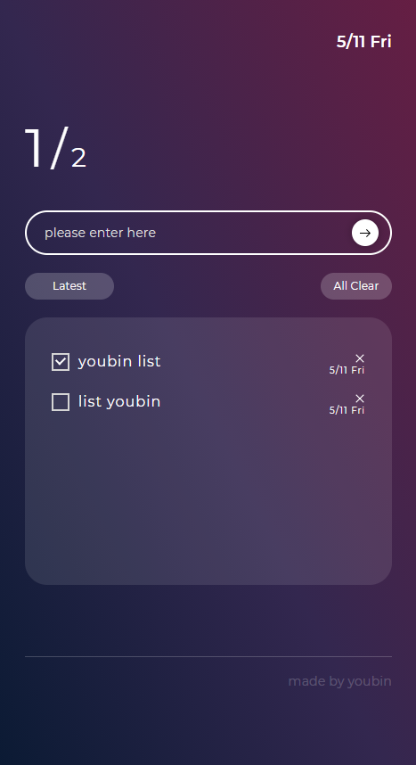
1. 화면설계
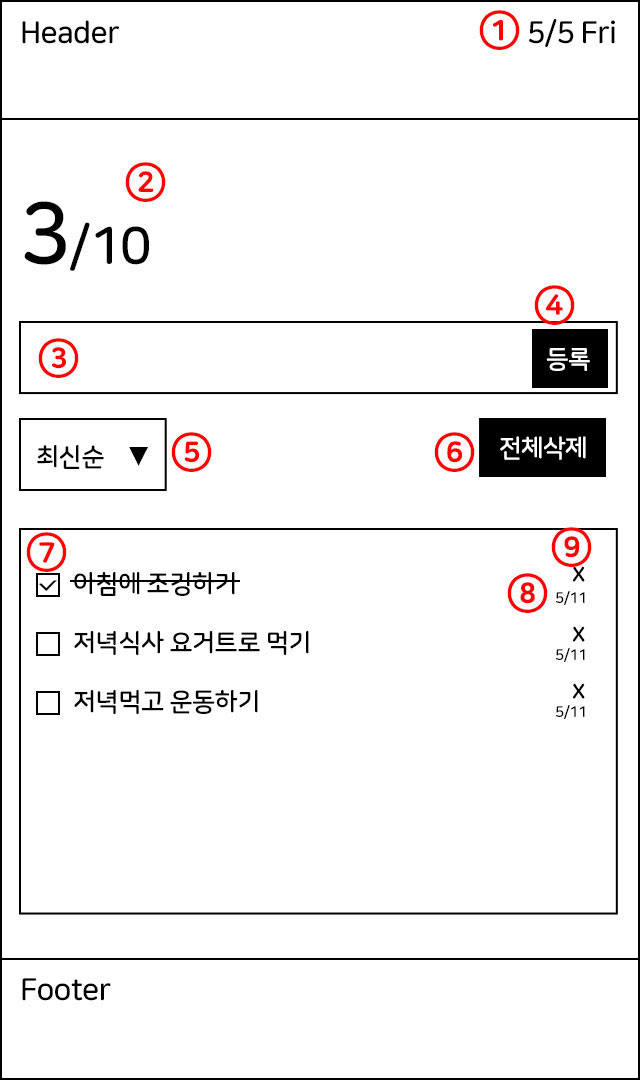
1) 오늘 날짜 노출
2) 리스트 총 개수와 리스트 완료여부 개수 나타남
3) 인풋
4) 인풋에 텍스트 입력 후 등록 버튼 누르면 리스트 추가
5) 최신순, 오래된 순에 따라 리스트 필터링
6) 전체삭제 버튼을 누르면 리스트 전체 삭제
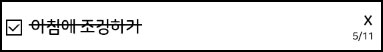
7) 체크박스 클릭 시 완료된 리스트
8) 등록한 날짜 노출
9) 한개의 리스트 삭제
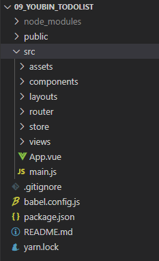
2. 폴더 구조
폴더 구조는 이러하다.
router와, store도 사용할 예정이니 프로젝트 생성할때 옵션을 선택해주자~
우선 layouts 폴더에 Header, Footer를 만들고 layouts/index.vue에 import 시킨 뒤,
내부 컨텐츠는 slot에 넣어줄 것이다.
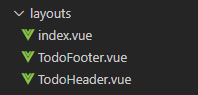
layouts/index.vue
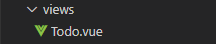
<template>
    <div>
        <todo-header></todo-header>
        <slot></slot> <!-- 여기에 컨텐츠 영역이 들어감. -->
        <todo-footer></todo-footer>
    </div>
</template>

<script>
import TodoHeader from './TodoHeader.vue'
import TodoFooter from './TodoFooter.vue'

export default {
    components: { TodoHeader, TodoFooter },

}
</script>
그런 뒤 views 폴더에 Todo.vue를 만들어준다.
Todo.vue에는 layouts/index.vue를 import 시켜주자.
views/Todo.vue
<template>
	<base-layout>
    	<!-- 여기에 마크업이 들어갈 예정이에요 -->
    </base-layout>
</template>

<script>
import BaseLayout from "@/layouts/index.vue";
이제 router에 views/Todo.vue 를 import 시켜줘야 한다.
그래야 화면에 Todo.vue가 보여질수 있으니까
router/index.js
import Vue from 'vue'
import VueRouter from 'vue-router'
import TodoList from '../views/Todo.vue'

Vue.use(VueRouter)

const routes = [
  {
    path: '/',
    name: 'Todo',
    component: TodoList
  }
]

const router = new VueRouter({
  mode: 'history',
  base: process.env.BASE_URL,
  routes
})

export default router
assets
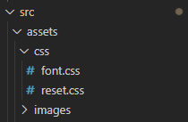
assets폴더에는 css,images폴더를 만들어주었다.
main.js
import Vue from 'vue'
import App from './App.vue'
import router from './router'
import store from './store'
// css
import '@/assets/css/reset.css';
import '@/assets/css/font.css';

Vue.config.productionTip = false

new Vue({
  router,
  store,
  render: h => h(App)
}).$mount('#app')
3. 컴포넌트 생성
프로젝트에 필요한 컴포넌트다.
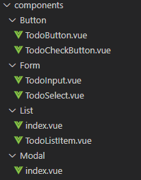
TodoButton.vue - 리스트를 등록할 버튼 컴포넌트
TodoCheckButton.vue - 리스트 완료 여부 체크 버튼 컴포넌트
TodoInput.vue - input 컴포넌트
TodoSelect.vue - 최신순, 오래된순을 선택하는 셀렉트박스 컴포넌트
TodoList.vue(List/Index.vue) - TodoListItem.vue를 여러개 뿌려주는 컴포넌트
TodoListItem.vue - 리스트 한개의 컴포넌트
TodoModal.vue(Modal/index.vue) - 알럿 팝업 컴포넌트
이외의 나머지 기능들은 일회성이기 때문에 컴포넌트화 시키지 않았다.
(물론 따지고 보면 이 프로젝트에서 나머지 컴포넌트들도 일회성이지만 실제 프로젝트에서 사용했을때를 생각하고 작업했음!)
TodoHeader
Header에는 오늘날짜가 노출된다.
<template>
    <header>
        <div class="wrap">
            <div class="date">
                5/11 Fri
            </div>
        </div>
    </header>
</template>

<script>
export default {

}
</script>

<style lang="scss" scoped>
header {
    padding: 40px 0 80px;
    .wrap {
        display: flex;
        justify-content: flex-end;
        padding: 0 30px;
    }
    .date {
        font-size: 18px;
        font-weight: 600;
        color: #fff;
    }
}
</style>
TodoFooter
<template>
    <footer>
        <div class="wrap">
            made by youbin
        </div>
    </footer>
</template>

<script>
export default {

}
</script>

<style lang="scss" scoped>
footer {
    padding: 80px 30px;
    .wrap {
        padding: 20px 0;
        color: rgba(255,255,255,.2);
        font-size: 14px;
        text-align: right;
        border-top: 1px solid rgba(255,255,255,.2);
    }
}
</style>
TodoButton
버튼은 btn-add/btn-clear 이렇게 두가지 타입으로 나눴다.
btnType을 props을 통해서 부모창에서 btnType="btn-add" or btnType="btn-clear"으로 값을 받으면
그에 따라 class가 들어가게 된다.
<template>
	<button
		:btnType="btnType"
		:class="btnType"
		class="button">
		<slot></slot>
	</button>
</template>

<script>
export default {
	name: "TodoButton",
	props: {
		btnType: {
			type: String,
			default: ''
		}
	}
}
</script>

<style lang="scss" scoped>
.button {
	// 추가버튼
	&.btn-add {
		display: inline-flex;
		justify-content: center;
		align-items: center;
		width: 30px;
		height: 30px;
		border-radius: 50%;
		background: #fff;
		box-shadow: 0 0px 10px rgba(0,0,0,.3);
		transition: all 0.3s ease-out;

		img {
			transition: all 0.3s ease-out;
		}

		&:hover {
			img {
				transform: translateX(3px);
			}
		}
	}
    // 모두 삭제 버튼
	&.btn-clear {
		width: 80px;
		height: 30px;
		padding: 5px;
		font-size: 12px;
		color: #fff;
		background: rgba(255,255,255,.2);
		border-radius: 20px;
		text-align: center;
	}
}
</style>
TodoCheckBox
<template>
	<button class="checkbox"></button>
</template>

<script>
export default {
	name: 'TodoCheckButton',
	props: {

	},
	data() {
		return {

		}
	},
	methods: {
	}
}
</script>

<style lang="scss" scoped>
.checkbox {
    &.checked {
        &:before {
            left: 3px;
            top: 2px;
            width: 10px;
            height: 7px;
            border: 2px solid #fff;
            border-top: 0;
            border-right: 0;
            transform: rotate(-45deg);
            z-index: 1;
        }
    }
    position: relative;
    display: block;
    width: 20px;
    height: 20px;
    border: 2px solid #d4d4d4;
    &:before {
        content: '';
        display: inline-block;
        position: absolute;
        margin: auto;
    }
}
</style>
TodoInput
input 도 역시 type, placeholder, value를 props로 받아 재활용이 가능한 컴포넌트로 만들어 주었다.
v-model을 컴포넌트에서 사용하기 위해 input 이벤트를 바인딩준다!
반드시 input 이벤트로 바인딩 해준다. v-model은 input이벤트로 받기 때문이다.
this.$emit('input', 인자값)을 하여 값을 넘겨주면 실시간으로 값이 바인딩 된다.
<template>
	<input
		:type="type"
		:placeholder="placeholder"
		:value="value"
		@input="change"
		>
</template>

<script>
export default {
	name: 'VueInput',
	props: {
		type: {
			type: String,
			default: ''
		},
		placeholder: {
			type: String,
			default: ''
		},
		value: {
			type: String,
			default: ''
		},
	},
	data() {
		return {
			isActive: false,
		}
	},
	methods: {
		change: function($event) {
			this.$emit('input', $event.target.value)
		}
	}
}
</script>

<style lang="scss" scoped>
input {
	width: 100%;
	height: 100%;
	padding: 10px 20px;
	font-size: 14px;
	color: #fff;
	border: 2px solid #fff;
	border-radius: 25px;
	transition: all .2s;
	&.on {
		box-shadow: 0 10px 10px rgba(0,0,0,.05);
		background-color: #fff;
	}
}

input {
	&::placeholder{
		font-size: 14px;
		color: #ddd;
	}
}

</style>
TodoSelect
<template>
    <select name="" id="">
        <option value="">Latest</option>
        <option value="">Oldest</option>
    </select>
</template>

<script>
export default {
    name: 'TodoSelect',

}
</script>

<style lang="scss" scoped>
select {
    width: 100px;
    height: 30px;
    padding: 5px;
    color: #fff;
    font-size: 12px;
    text-align-last: center;
    background: rgba(255,255,255,.2);
    border-radius: 20px;
    option {
        color: #000;
    }
}

</style>
TodoListItem
list 한개에 대한 컴포넌트이다.
리스트 안에 체크박스, 삭제버튼, 날짜 기능이 같이 들어있으니 함께 마크업 해준다!
체크박스 버튼은 컴포넌트를 만들어두었으니 import해준뒤 사용하자.
<template>
    <div class="list-item">
        <div class="left-area">
            <TodoCheckButton/>
            <p class="label">label</p>
        </div>
        <div class="right-area">
            <button class="close">close button</button>
            <div class="date">5/11 Fri</div>
        </div>
    </div>
</template>

<script>
import TodoCheckButton from '@/components/Button/TodoCheckButton.vue'

export default {
    name: 'TodoListItem',
    components: { TodoCheckButton },
    props: {
    },
    methods: {

    }
}
</script>

<style lang="scss" scoped>
.list-item {
    position: relative;
    display: flex;
    justify-content: space-between;
    align-items: center;
    margin-bottom: 25px;
    .left-area {
        display: flex;
        align-items: center;
        .label {
            padding-left: 10px;
            color: #fff;
            letter-spacing: 1px;
        }
    }
    .right-area {
        .close {
            position: relative;
            width: 12px;
            height: 12px;
            top: -5px;
            right: 0;
            font-size: 0;
            &::before, &::after {
                content: '';
                display: block;
                position: absolute;
                top: 50%;
                left: 50%;
                background-color: #fff;
                transform: translate(-50%,-50%) rotate(45deg);
            }
            &::before {
                width: 1px;
                height: 100%;
            }
            &::after {
                width: 100%;
                height: 1px;
            }
        }
        .date {
            position: absolute;
            right: 0;
            top: 15px;
            color: #fff;
            font-size: 10px;
            letter-spacing: 1px;
        }
    }
}
</style>
TodoList
TodoListItem를 v-for를 이용해 뿌리기 위한 컴포넌트다.
<template>
    <div>
        <TodoListItem
            v-for="(item, key) in items"
            :key="key"/>
    </div>
</template>

<script>
import TodoListItem from '@/components/List/TodoListItem.vue'
export default {
    name: 'TodoList',
    components: { TodoListItem },
    props: {
        items: {
            type: Array,
        },
    },
    data() {
        return {

        }
    },
    methods: {
    }
}
</script>

<style lang="scss" scoped>
.no-list {
    font-size: 14px;
    color: rgba(255,255,255,.7);
}
</style>
TodoModal
팝업이 띄워질때 transition을 주기 위해 transition으로 묶어준다.
name을 주면 css에서 처리할때 name값을 class처럼 앞에 붙여주면 transition효과를 줄 수있다!
.'name값'-leave-active {

    transition: opacity 0.3s ease;

}
@click이벤트로 $emit('close')를 부모에게 넘겨주어 닫기버튼을 누르면 close이벤트가 일어나게 하였다.
<template>
	<transition name="modal" appear>
		<div
			@click.self="$emit('close')"
			class="modal">
			<div class="modal-box">
				<button
				@click="$emit('close')">닫기</button>
				<slot></slot>
			</div>
		</div>
	</transition>
</template>

<script>
export default {
	name: 'Modal',
}
</script>

<style lang="scss">
.modal {
	position: fixed;
	top: 0;
	left: 0;
	right: 0;
	bottom: 0;
	background-color: rgba(0,0,0,.6);
	display: flex;
	justify-content: center;
	align-items: center;
	z-index: 100;
	.modal-box {
		position: relative;
		padding: 50px 30px 30px;
		background-color: #fff;
		button {
			position: absolute;
			top: 20px;
			right: 20px;
			width: 18px;
			height: 18px;
			background: url('~@/assets/images/close_btn.png') no-repeat;
			background-size: 100%;
			font-size: 0;
		}
	}
}

.modal-enter-active, .modal-leave-active {
	transition: opacity 0.3s;

	.modal-box {
		transition: opacity 0.3s, transform 0.3s;
	}
}

.modal-leave-active {
	transition: opacity 0.3s ease;
}

.modal-enter, .modal-leave-to {
	opacity: 0;

	.modal-box {
		opacity: 0;
		transform: translateY(-10px);
	}
}
</style>
3. 마크업
만들어둔 컴포넌트를 이용하여 마크업을 해보자.
<template>
	<base-layout>
        <div class="wrap">
            <ul class="count-area">
                <li class="complete">1</li>
                <li class="all">10</li>
            </ul>

            <div class="add-area">
                <todo-input
                    v-model="text"
                    placeholder="please enter here"
                ></todo-input>
                <todo-button
                    btnType="btn-add">
                    <img src="@/assets/images/btn_go.png" alt="">
                </todo-button>
            </div>

            <div class="filter-area">
                <todo-select></todo-select>
                <todo-button
                    btnType="btn-clear">All Clear</todo-button>
            </div>

            <div class="list-area">
                <todo-list
                    :items="todoList"
                ></todo-list>
            </div>
        </div>
    </base-layout>
</template>

<script>
import BaseLayout from "@/layouts/index.vue";
import TodoList from "@/components/List/index.vue";
import TodoInput from '@/components/Form/TodoInput.vue';
import TodoButton from '@/components/Button/TodoButton.vue';
import TodoSelect from '@/components/Form/TodoSelect.vue';

export default {
    name: 'Todo',
    components: {
        BaseLayout,
        TodoList,
        TodoInput,
        TodoButton,
        TodoSelect
    },
    data() {
        return {
            text: '',
            todoList: [
            	{
                	title: 'youbin list',
                    complete: false
                },
                {
                	title: 'list youbin',
                    complete: false
                }
            ]
        }
    },
    methods: {
    }
}
</script>

<style lang="scss" scoped>
.wrap {
    width: 100%;
    padding: 0 30px;
}

.count-area {
    display: flex;
    align-items: baseline;
    margin-bottom: 40px;
    color: #fff;
    .complete {
        position: relative;
        padding-right: 25px;
        margin-right: 5px;
        font-size: 60px;
        &::after {
            content: '/';
            display: block;
            position: absolute;
            right: 0;
            bottom: 3px;
            font-size: 50px;
        }
    }
    .all {
        font-size: 30px;
    }
}

.add-area {
    position: relative;
    width: 100%;
    height: 50px;
    margin-bottom: 20px;
    input {
        position: absolute;
        width: 100%;
    }
    button {
        position: absolute;
        right: 15px;
        top: 0;
        bottom: 0;
        margin: auto;
    }
}

.filter-area {
    display: flex;
    justify-content: space-between;
    margin-bottom: 20px;
}

.list-area {
    width: 100%;
    min-height: 300px;
    padding: 40px 30px;
    background-color: rgba(255,255,255,.1);
    border-radius: 25px;
}

</style>
부모에서 자식컴포넌트(TodoList.vue)에 items라는 이름으로 값을 바인딩 해주면,
<!-- 부모컴포넌트(Todo.vue) --> <todo-list :items="todoList" @check="todoCheck" ></todo-list>자식컴포넌트(TodoList.vue)에서 props로 값을 받아준다.
여기서도 역시 item이라는 이름을 자식(TodoListItem.vue)에게 한번 더 바인딩해주자.
<!-- 자식 컴포넌트(TodoList.vue) -->

<template>
    <div>
        <TodoListItem
            v-for="(item, key) in items"
            :key="key"
            :item="item"/>
    </div>
</template>

<script>
import TodoListItem from '@/components/List/TodoListItem.vue'
export default {
    name: 'TodoList',
    components: { TodoListItem },
    props: {
        items: {
            type: Array,
        },
    },
    data() {
        return {

        }
    },
    methods: {
    }
}
</script>

<style lang="scss" scoped>
.no-list {
    font-size: 14px;
    color: rgba(255,255,255,.7);
}
</style>
그래야 자식(TodoListItem.vue)에서 최상단 부모(Todo.vue)에 있는 todoList 데이터를 뿌려줄 수 있다!
<!-- 자식 컴포넌트(TodoListItem.vue) -->

<template>
    <div class="list-item">
        <div class="left-area">
            <TodoCheckButton
                :class="{ 'checked' : item.complete }"/>
            <p class="label">{{ item.title }}</p>
        </div>
        <div class="right-area">
            <button class="close">close button</button>
            <div class="date">5/11 Fri</div>
        </div>
    </div>
</template>

<script>
import TodoCheckButton from '@/components/Button/TodoCheckButton.vue'

export default {
    name: 'TodoListItem',
    components: { TodoCheckButton },
    props: {
        item: {
            type: Object,
            require: true
        },
    },
    methods: {

    }
}
</script>

<style lang="scss" scoped>
.list-item {
    position: relative;
    display: flex;
    justify-content: space-between;
    align-items: center;
    margin-bottom: 25px;
    .left-area {
        display: flex;
        align-items: center;
        .label {
            padding-left: 10px;
            color: #fff;
            letter-spacing: 1px;
        }
    }
    .right-area {
        .close {
            position: relative;
            width: 12px;
            height: 12px;
            top: -5px;
            right: 0;
            font-size: 0;
            &::before, &::after {
                content: '';
                display: block;
                position: absolute;
                top: 50%;
                left: 50%;
                background-color: #fff;
                transform: translate(-50%,-50%) rotate(45deg);
            }
            &::before {
                width: 1px;
                height: 100%;
            }
            &::after {
                width: 100%;
                height: 1px;
            }
        }
        .date {
            position: absolute;
            right: 0;
            top: 15px;
            color: #fff;
            font-size: 10px;
            letter-spacing: 1px;
        }
    }
}
</style>
이렇게 까지 하면 일단 마크업, 임의로 만들어 준 데이터까지 뿌려주기 완성!!!
이제 다음번엔 vuex를 사용해보도록 해야징~~! ♥
'Study > Vue' 카테고리의 다른 글
[vue] vue props으로 넘긴 값 배열로 받고싶을때 (0) 2022.06.02 [Vue] CDN 방식으로 사용 시 v-if에 대한 이슈 (0) 2021.05.31 [Vue] v-model (양방향 바인딩) (0) 2021.05.06 [Vue] v-bind(단방향 바인딩) (0) 2021.05.06 [Vue] Vue CLI 설치하기(yarn) (0) 2021.05.06 댓글
